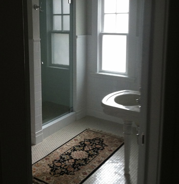
About a year ago, I posted about our DIY bathroom project that followed the premise “When there is no money, throw time at the problem”. That, in part, explained why after several months work, the bathroom looked pretty much like we’d just started. We live in a 1912 house, and this bathroom had been remodeled somewhere around 1950. Ever since we moved in, I’d wanted to make it a beautiful ommage to 1912 (with all the modern amenities, of course), so we took it down to the studs.
Well, a grueling 16 months after it began I’m happy to report the bathroom is finished! And, as promised, I’m now posting “afters”. I adore my new bathroom. But remodeling to return a room to it’s former glory comes with one potential downside: If you do your work too well, no one will know you did anything at all. So, for those interested in old house details, here are a few highlights.
Remember the doorknob?
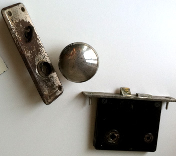
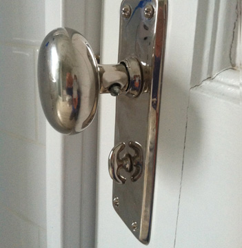
I was all set to buy a new one, thinking this one was a badly worn artifact of the mid century remodel. It did not match the other knobs in our house; in fact it didn’t even look to me like it would have come from 1912. But a painter that had been working in our house told me that it was indeed original. Although the hall knob (on the other side of the door) was quite ornate, the inside bathroom knob and the inside kitchen knobs were simple and smooth, in an early twentieth century attempt to create a more sterile environment. And since chrome was not the finish of the day, these knobs were usually plated in polished nickel. The story intrigued me so much, I had the knob re-plated in nickel, even though everything else in the bathroom is chrome. I guess I’m not a purist—or maybe that means I am…
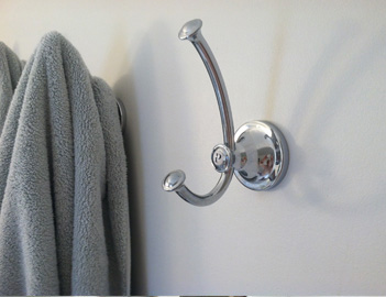
You might recognize the towel hooks from a past blog entry. That easy project adds just the right detail to the new space.
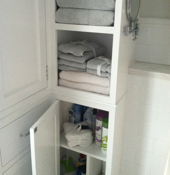
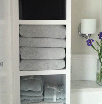
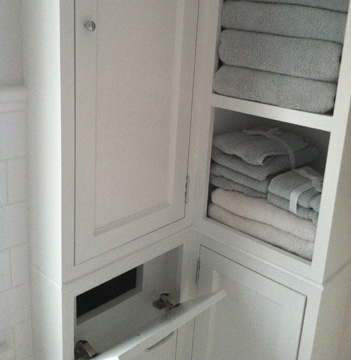
I am in awe of the beautiful yet practical storage my husband built, including open shelves for towels, closed deep cupboards for cleaning supplies, shallow storage for small items and a built in hidden laundry chute!
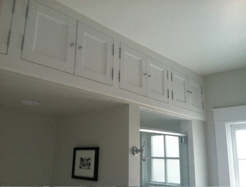
Above the tub and shower, a row of new-to-look-old cupboards stash anything you don’t care to see for a while.
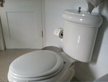
Our original commode looks right at home here.
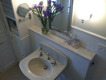
As does the vintage sink we snagged at the salvage yard.
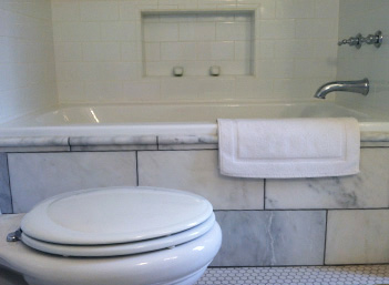
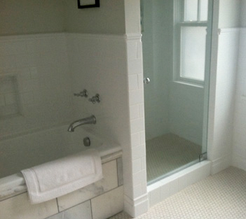
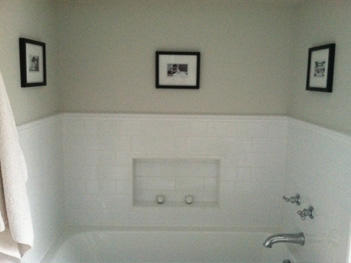
We found a beautiful, simple cast iron drop-in tub from Waterworks at a local shop. The person that had ordered it changed their mind and I was thrilled to see the exact item I was lusting after online (lusting after, but not being able to afford). The shop gave me a deep discount, and I didn’t have to pay to have it shipped either. Since I was looking for a solution that would marry a modern drop-in tub with a 1912 house, we ended up cutting 18” square marble tiles from Home Depot in half to create an oversized brick pattern to mimic the subway tile.
By moving the tub to the corner, we were able to fit in a separate shower, something I have always wanted. An almost invisible glass door keeps the corner clean and understated, even though it’s a bit of a departure from 1912. Trying to match the age of a house can be tricky with kitchens and bathrooms. My philosophy: strike a balance between comfort and style. You want to live in a house, not a history museum. But I do think the chrome knob on the shower (rather than the standard towel bar) adds a little old-timey class.
The sink is mounted on a short wall sporting a marble cap. This was a feature I chose for practicality as well as authenticity. I found the marble piece at a scrapyard, and my husband (with the help of a few extra saw blades) was able to cut it down to size. Above that, we installed the Restoration Hardware Framed Medicine Cabinet.
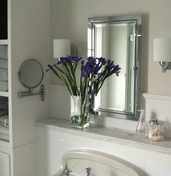
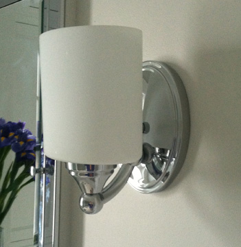
Quite possibly, the most difficult decision was what lights to install. My husband (my lighting expert) suggested two lights, one on each side of the mirror, with the bulbs pointing up, for a “soft bounce” off the ceiling. It was the perfect idea. This set-up provides beautiful, flattering light that easily removes ten years from your age when you look in the mirror. So, that was decided, but where to find just the right lights that celebrate the vintage without looking too fussy? I finally landed on lights from one source and glass shades from another. I got the lights online because I liked the vintage style. Then I bought an inexpensive two armed wall light from Home Depot because I really liked the modern looking straight-sided oval glass shades. I put those with my vintage lamps and they are (in my opinion) the perfect balance of old and new. (or maybe I just like to mettle). At any rate, it was an inexpensive way to get a unique look.
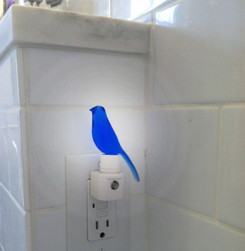
And speaking of lights, doesn’t every bathroom need a nightlight? I came across this sweet one online, and couldn’t resist.
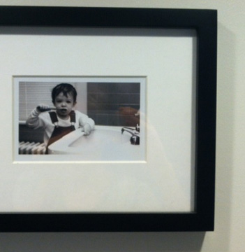
I framed black and white pictures of my kids in the old bathroom, bringing these sweet, nostalgic moments to my current bathroom. And now they adorn the three walls surrounding my tub.
Just for fun, here’s where I found our tub spout, tub handles, shower handles, laundry chute pull and cupboard door knobs.
I’m so giddy about my bathroom remodel I don’t even mind the fact that some people may not know I did anything. The hotel-like amenities and soaking tub provide a welcome retreat in which I will celebrate this finish for years to come!
